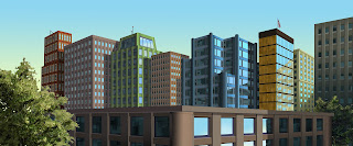
Below are the assignments I completed during this summer in classes at Digipen in redmond,WA, focusing on the environment, both interior and exterior. Comments and constructive criticism is always welcome.
This midieval house was created in 2 point perspective in Photoshop.
This bladerunner inspired piece is 1 point perspective, also, entirely in Photoshop.
Matte painting cityscape, 2 point perspective in Photoshop.
This is a color key created for an animation. Done in Photoshop.
My first ever 2 point perspective piece done entirely in Photoshop.
An exterior scene, created in Maya 2012 and textured in Photoshop and mudbox. The scene also includes an HDRI sky dome and some paint effects, also done in Maya.
A different render view of the same scene from above.
An interior scene created in Maya and textured using Photoshop. Madmen was my inspiration on this one.
Derek's Art
Thursday, July 26, 2012
Saturday, April 14, 2012
3d max character
The final product from my first full character design. Modeled in 3dsmax, and textured and formatted in Photoshop. The character was created in a style congruent with Skyrim.
Here are a few screenshots and renders of my current character progress. I envision this character in Skyrim. Below is a wireframe, my bone rigging and 2 quick renders. Animation to follow.
Monday, April 9, 2012
various characters created this year
This is my first 30 second animation. It took a full year working with my classmate, Jakob Zoepfl, to finish. I created and animated the small guy and drew the background. All of this was done in the traditional form on paper. Then we scanned and imported the frames into Photoshop for clean up, then Tonboom for final compilation. Its not perfect but it is a good first try.
Friday, March 23, 2012
Friday, February 3, 2012
Thursday, January 26, 2012
Thursday, December 15, 2011
CG artwork- my excavator
Yep, its called an excavator but it doesnt really dig any dirt. So I changed the name to the Destroyer.
Above is my concept art. This was redone. My original concept art was not up to par. I get it now.
Above is the finished artwork for my destroyer. I feel it came out well.
Above is my concept art. This was redone. My original concept art was not up to par. I get it now.
Above is the finished artwork for my destroyer. I feel it came out well.
Subscribe to:
Comments (Atom)


