 | The drawing to the left is a charcoal study done on 18" by 24" paper. In Order to get this on my computer with little hassle, I took a picture. As is the case. I lost some resolution with the photo, but the final outcome will not be affected as this will serve more as a reference for the final piece than a major part of it. As with any figure drawing, gesture and proportions are two important factors in choosing a drawing to bring to a finished state. I chose this one for those reasons. The proportions are close (not perfect) and the pose seems to have a little attitude in it. Some of these traits I may keep and exploit, while others may get scrapped along the way. This drawing gave me a good jumping off point. |
 | The next step in the process is to take the image into photoshop and I completely erased the background. Now I have a figure that I can copy and place into any situation I create. For now, I am working only in greyscale. |
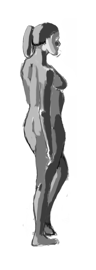 | After cutting the figure out of the background. I am cleaing the edges up a little bit. I also blocked in the light and dark shapes of the figure. Notice, I did not spend a huge amount of time on this. The main idea is to get something clear and workable, not to have a finished figure with no surroundings. You can see that I have also changed the left leg to suit my ideas. |
 | The first major step to getting a quality final piece comes in here with thumbnails. These are done in greyscale still and show 5 different ideas that I came up with for the figure that I picked. The top left idea was originally what I had intended for this figure. As you will notice, this is not the idea I chose to do my finished piece with though. Notice, I am thinking of light source and composition in each of these thumbs. A couple of them show promise, while others are just bad ideas. It is good to get these out of the way as soon as possible. Two very important aspects at this stage and everyone after this point are strong research and critique. The best ideas for my painting came from others. |
 | I felt that this thumbnail had the most promise. It is a clear composition, nice light source and can easily adapt as story as to the figure, her life, stature and even thoughts. At this point, I am still pushing some other thumbnails to a more finished state to see what may come of them as well. |
 | This is my first color composition. The colors in the top right corner make up the palette. Research is very necessary here. The better the research, the better the comps. For color, I was pointed to some very gifted photographers and I pulled the colors directly for the photos by opening them in Photoshop and using the eye drop tool to sample them. |
 | This is a variation of the first color comp. |
 | Some variations are better than others. This one was not one of the better. However, trying different color ideas are the only way to see if they will work. One trick I learned was to take my greyscale composition and bring it to a very polished state. Afterwards, create a new layer above it and change the state of that layer to color. Once this is done, you can simply paint in that layer and it will color your greyscale comp without losing the details. It is just one easy way to get color to it. |
 | This painting was derived from the second greyscale comp I created. After giving up on the fire, I came up with this. Again, I used alot of reference for color and for the elephant. At this point, I still didn not have a good grasp for what color scheme I wanted was. Critiques from my teachers and class as well as friends helped along the way. |
 | Another version of the above scene |
 | Yet another version of my first comp. This one has more red in it. |
 | This is my final color composition and it was my favorite. By chance, it came across on accident. I accidently copied one of my color layers and this came up. There are still many things that bother me with this, but the overall feeling of it made me want to finish it. |
 | Now working on the above color comp and taking it to a finished piece, the first thing to set up is a hue/saturation layer. Turn the saturation to zero. Place this layer to the top of the stack. Now, with a single click I am easily able to switch from color to greyscale and back. Greyscale with show you where the flaws are in a painting when the colors are lying to you. So it is good to know. |
 | I decided to divide this painting into 2 pieces. Figure and the foreground as is seen in this picture, and the background. Because I liked my figure and the ground and also because I wanted to practice working with masks, I chose to use the lasso tool and select the entire background. Once that was entirely selected, I made a new layer and created a mask. Now when I paint in this layer, It will only affect the purple areas. Everything else is masked. |
 | With the mask layer in place I can now bring in some of my research and resize it to see if that is the look I am going for. I probably made 9 of these layers as copies and kept adding in different ideas until I found something that I really liked. This helped me with the sky alot because I kept finding myself doodling clouds for long periods of time until they looked way overdone and then I would start over. My colors were all over the place and the reference photos did a good job of grounding me to a concrete idea and color palette. |
 | At this point, I have painted in a background that I am happy with. After all of the research, I finally get a feeling of depth and atmosphere that I was missing in some of my earlier comps. I am now more interested in the background than I am the foreground.....oops. |
 | Here is my finished piece. It wasnt until this point that I finally fixed some proportion issues with the figure. That was not by design as I was working on these the entire time. I added the details in the hair and finally added some clothing. The idea for that came from old Frank Frazetta paintings. All in all, I think this was a success for my first time bringing a drawing into Photoshop and bringing it to a nice color painting. |
Tuesday, November 15, 2011
Turning a traditional drawing into a full color painting in Photoshop
Subscribe to:
Posts (Atom)